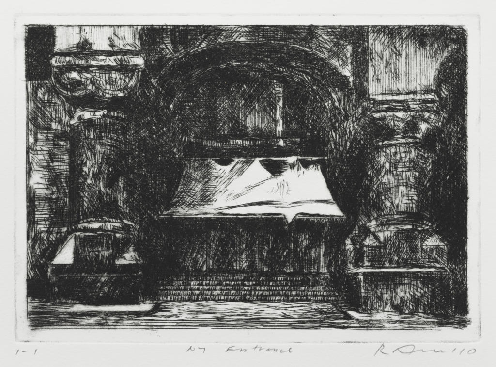
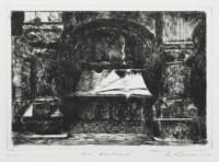
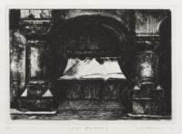
I. 1st state of 3
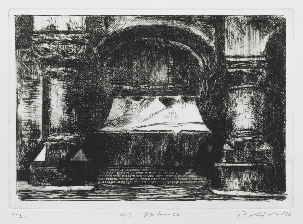
II. 2nd state of 3
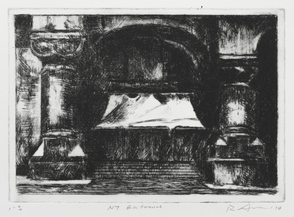
III.a. 3rd and final state
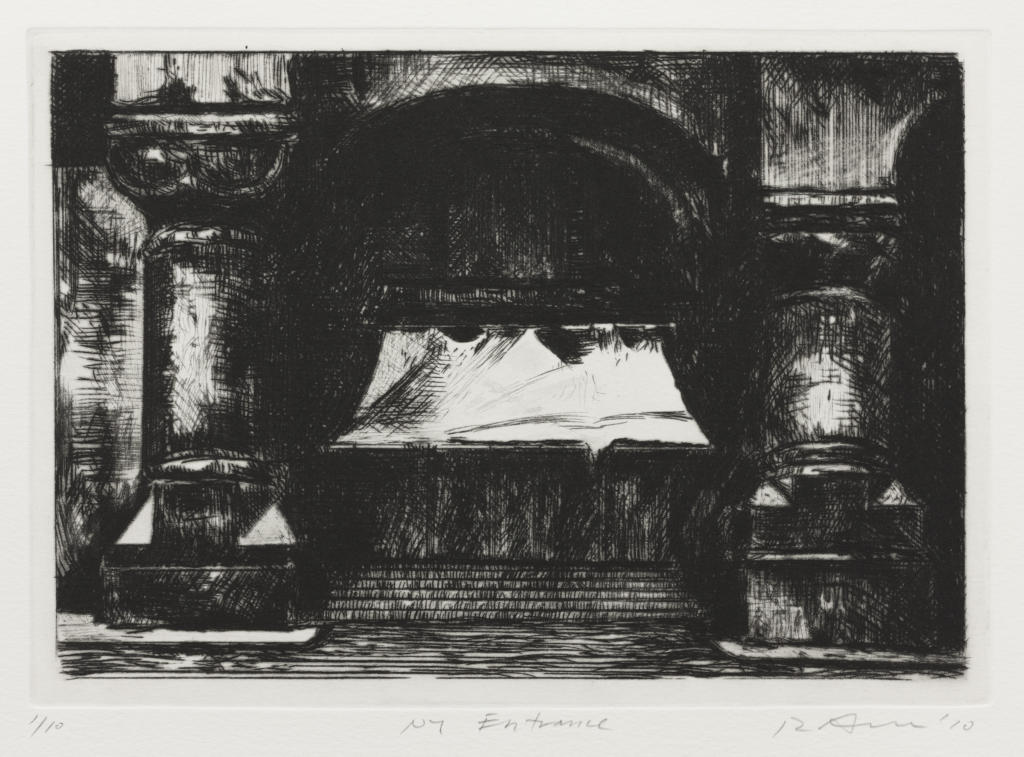
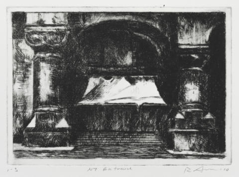
Edition impression, 2010 (Featured Image)
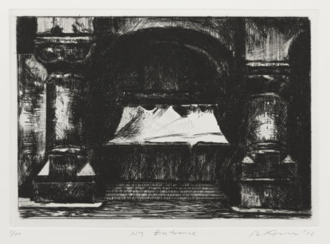
E.159 NY entrance 2010
I. 1st state of 3
Drypoint. A frontal depiction of a building with a flight of steps leading up from the pavement to an arched entrance with a canvas awning; on either side of the entrance are stocky columns on heavy, faceted bases. The composition is rendered entirely in drypoint and is drawn within approximately 10 mm of the plate mark.
Impression on wove BFK Rives paper, printed by Rick Amor in his Alphington studio. Inscribed in pencil, below the plate mark: lower left: ‘1-1’; lower centre: ‘NY Entrance’; lower right: signed and dated ‘R Amor ’10’.
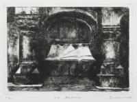
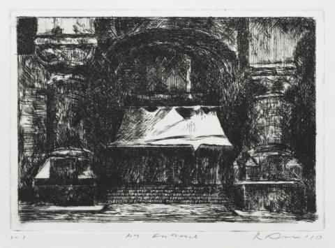
II. 2nd state of 3
The plate has been selectively burnished in many places; the burnishing provides highlights that reduce the flatness of the composition, giving it a greater depth, and providing the building with increased bulk and clearer architectural details. At the same time, drypoint has been added to strengthen the shadows, notably on the inside of each column at its base.
Selectively wiped impression on wove BFK Rives paper with watermark, printed by Rick Amor in his Alphington studio. Inscribed in pencil, below the plate mark: lower left: ‘1-2’; lower centre: ‘NY Entrance’; lower right: signed and dated ‘R Amor ’10’.
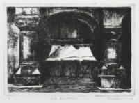
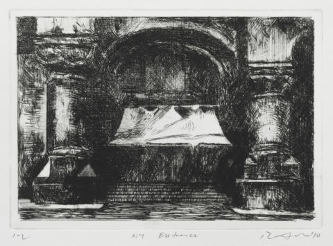
III.a. 3rd and final state
Oblique drypoint strokes have been added to the awning at left, and strokes of vertical shading have been added to the upper stem of the right-hand column. New burnishing also appears to the left of the left column, and on the base of the column at right. There are four variant impressions of this state.
Edition impression, 2010 (Featured Image)
Drypoint. A frontal depiction of a building with a flight of steps leading up from the pavement to an arched entrance with a canvas awning; on either side of the entrance are stocky columns on heavy, faceted bases. The composition is rendered entirely in drypoint and is drawn within approximately 10 mm of the plate mark.
The plate has been selectively burnished in many places; the burnishing provides highlights that reduce the flatness of the composition, giving it a greater depth, and providing the building with increased bulk and clearer architectural details. At the same time, drypoint has been added to strengthen the shadows, notably on the inside of each column at its base.
Oblique drypoint strokes have been added to the awning at left, and strokes of vertical shading have been added to the upper stem of the right-hand column. New burnishing also appears to the left of the left column, and on the base of the column at right. There are four variant impressions of this state.
- Catalogue Number
- E.159
- Title and Date
- NY entrance 2010
- Description of Featured Image
- A frontal depiction of a building with a central flight of steps leading up to an arched entrance with a canvas awning; on either side of the entrance are stocky columns on heavy, faceted bases.
- Where Made
- Alphington, Melbourne
- Medium Category and Technique
- Intaglio Print: Drypoint and burnishing on copper
- Support
- Wove paper. Identified papers: BFK Rives paper with watermark: ‘BFK RIVES / FRANCE’ with infinity symbol; Arches paper with watermark: ‘ARCHES / FRANCE’ with infinity symbol.
- Dimensions
-
Image size: 189 x 267 mm
Matrix size: 190 x 269 mm - Artist’s Record Number
- RAE.189
- Printer(s) and Workshop(s)
- States I and II printed by Rick Amor in his Alphington studio. State III printed by Amor in the Alphington studio (III.a and III.b) and by Rosalind Atkins at Kate Herd’s studio, Alphington (III.c and III.d). Edition printed by Rosalind Atkins at Kate Herd’s studio.
- Summary Edition Information
- Three states. Edition of ten numbered impressions, 2010.
- Collections
- State Library of Victoria, Melbourne: six state impressions, numbered 1-1 through 1-5, 2-5; ed. 2/10.
- Comment
The New York building depicted here is located near the Greene St Studio, a studio space administered by the Visual Arts/Craft Board (Australia Council), which Amor used during a four-month residency in 1996. Amor was drawn to this particular building for the grandeur of its entrance and because he has always found entrances, as well as the facades of buildings, intriguing – for what they withhold about what lies beyond.
E.159 is based on a much earlier gouache, which itself was based on a photograph (now lost). The print is a pure drypoint, whose development from the first to the final state was straightforward. However, in the proofing of the third and final state, there was some experimentation with the colour of the ink and the wiping of the plate. Due to the presence of burr in a densely worked drypoint such as this, it can be difficult to control printing effects precisely; because of this, there is some slight variation in the edition impressions.
A faint scratch appears on the awning in the AP impression, extending from the upper left to the notch at the lower right. The scratch is not disfiguring but it remains visible in a number of the impressions in the edition.
- Keywords
- New York
- URL
- https://catalogue.rickamor.com.au/works/intaglio/n-y-entrance/
Record last updated 17/02/2021