
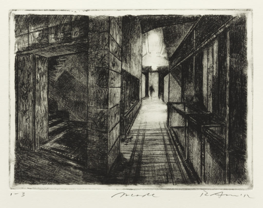
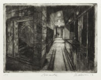
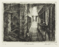
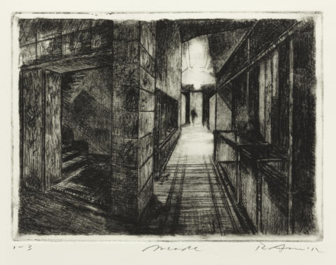
I. 1st state of 11, 2012
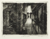
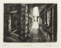
III. 3rd state of 11, 2012
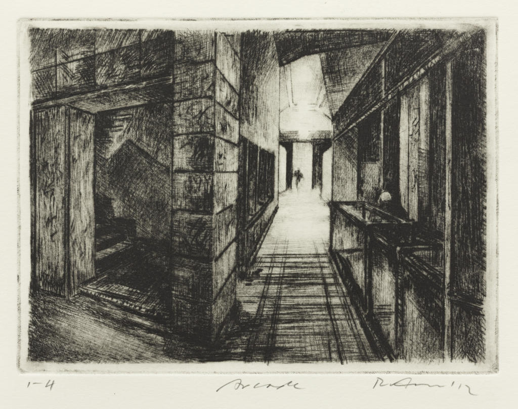
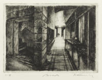
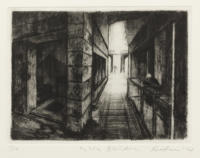
IV. 4th state of 11, 2012
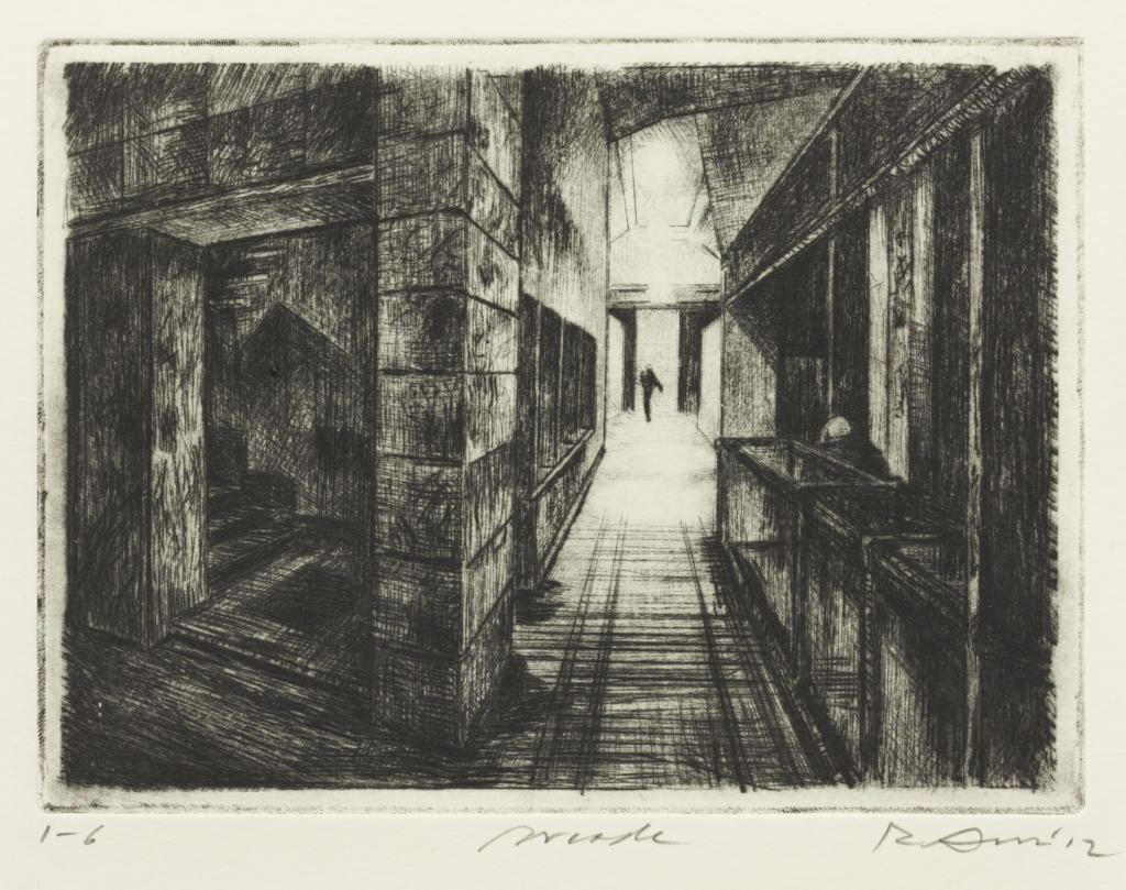
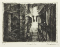
VI. 6th state of 11, 2012
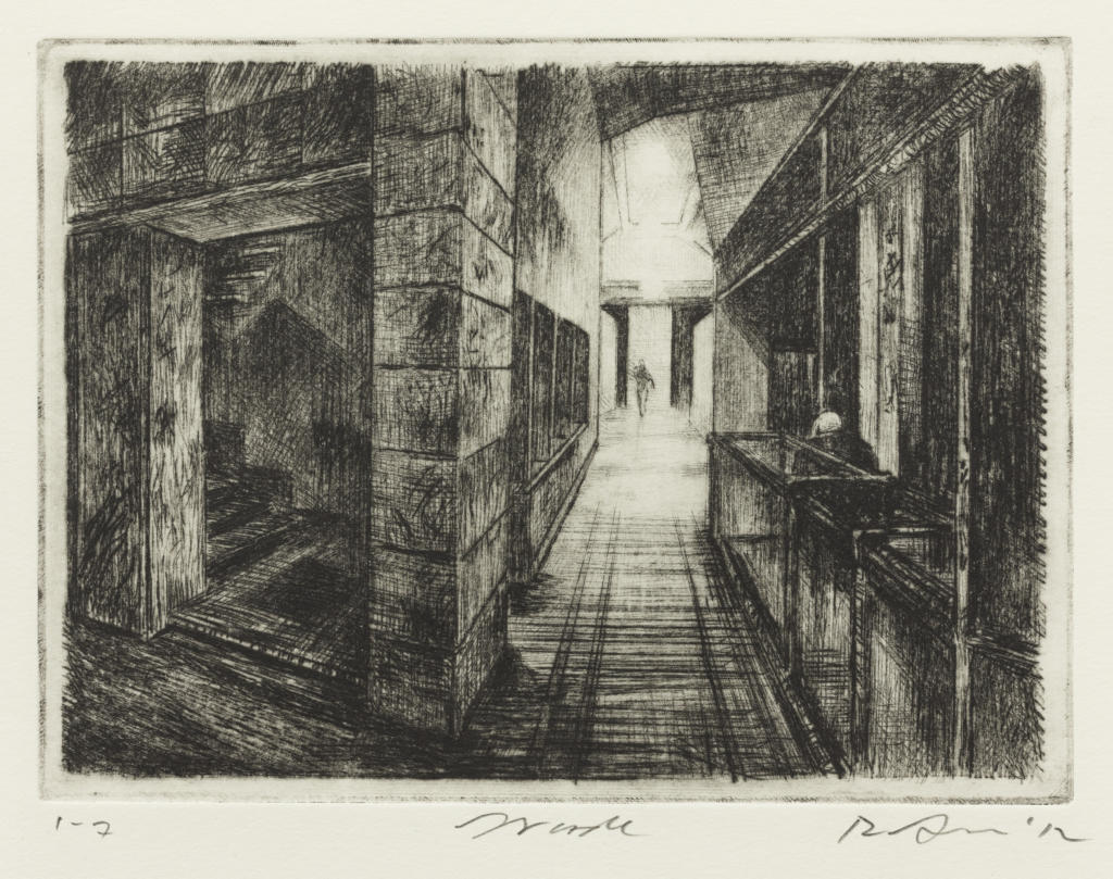
VII.a. 7th state of 11, 2012
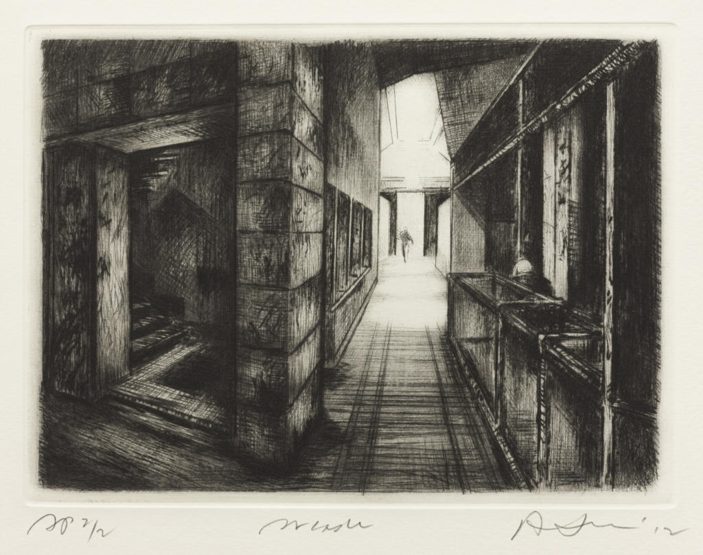
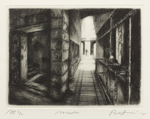
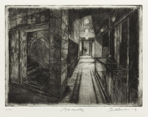
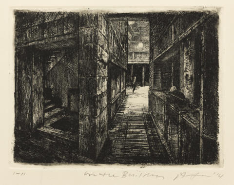
Artist’s proof (from first edition, 2012; impression of 8th state of 11) (Featured Image)
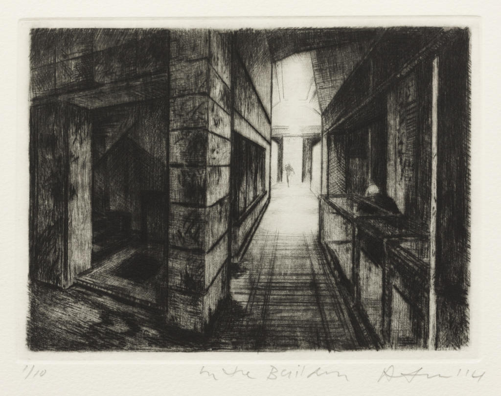
Edition impression (second edition, 2014), as In the building
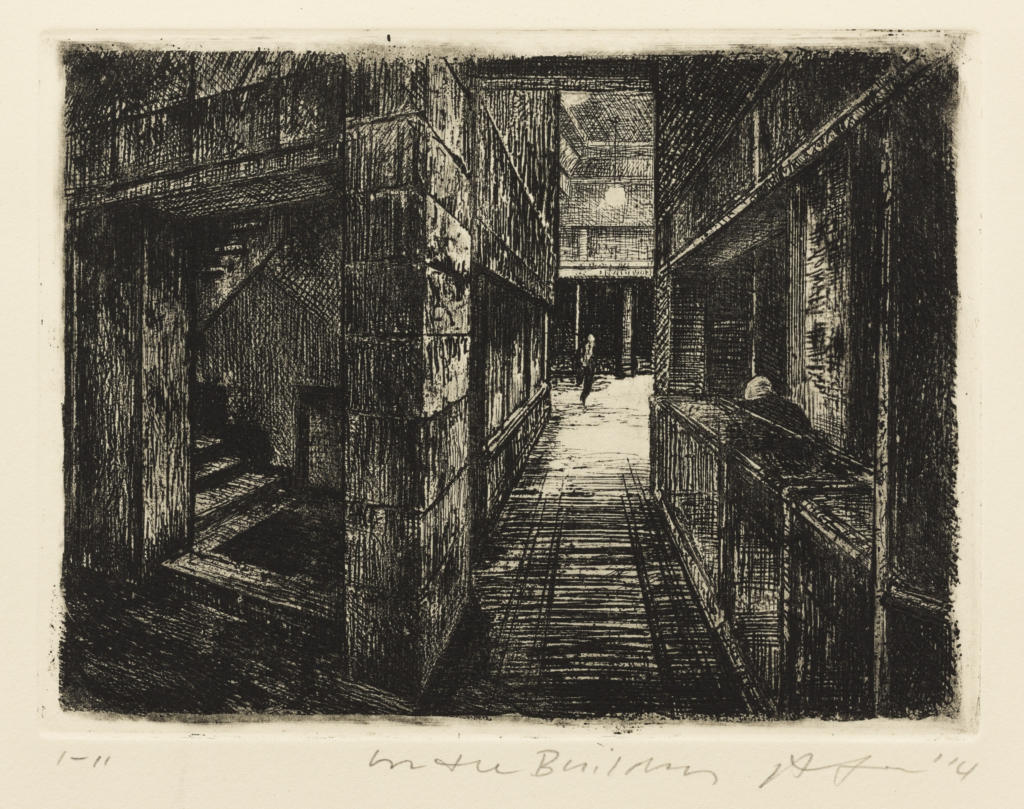
XI. 11th and final state, 2014, as In the building

E.171 Arcade 2012; reworked and retitled 2014
I. 1st state of 11, 2012
Drypoint. A view along a corridor from the corner of an inner-city shopping arcade, with a figure in the far distance at a doorway; the surrounding area is illuminated by three circular hanging lamps. At the centre right is the partial, rear view of the figure of a man beside a glass vitrine. At left, in the corner of the building, is an entrance to a stairwell. The image is constructed with sharply receding one-point perspective. In its first application here, the drypoint is worked in a graphic, rather than tonal, way.
Impression with plate tone, on wove Somerset paper, printed by Rick Amor in his Alphington studio. Inscribed in pencil, below the plate mark: lower left: ‘1-1’; lower centre: ‘Arcade’; lower right: signed and dated ‘R Amor ’12’.
III. 3rd state of 11, 2012
Lines of horizontal shading on the corridor floor now extend evenly from the foreground to the end of the furthermost vitrine. The outlines of the vitrines have been strengthened with drypoint, and the floor around the stairwell corner has been darkened. The most distant pool of light on the floor at the end of the corridor has been covered with delicate strokes of drypoint.
Impression on cream wove paper, printed by Rick Amor in his Alphington studio. Inscribed in pencil, below the plate mark: lower left: ‘1-3’; lower centre: ‘Arcade’; lower right: signed and dated ‘R Amor ’12’.
IV. 4th state of 11, 2012
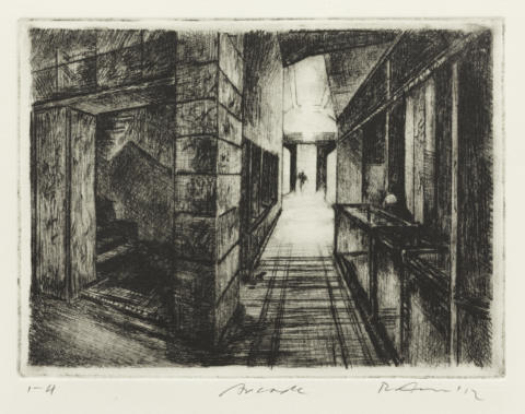
The area around the three hanging lights, and their reflection on the floor, has been burnished, causing the figure to disintegrate in the distance. Horizontal hatching has been added to the bottom of the middle vitrine. The head of the figure at right has also been burnished and now can be seen clearly.
Impression on cream wove paper, printed by Rick Amor in his Alphington studio. Inscribed in pencil, below the plate mark: lower left: ‘1-4’; lower centre: ‘Arcade’; lower right: signed and dated ‘R Amor ’12’.
VI. 6th state of 11, 2012
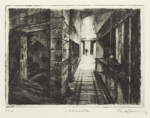
The figure in the distance has been filled in with drypoint, and horizontal lines have been added to the entablature above the doorway. Two patches of shadow to the left of the corridor have been strengthened and extended.
Impression with light plate tone, on cream wove paper, printed by Rick Amor in his Alphington studio. Inscribed in pencil, below the plate mark: lower left: ‘1-6’; lower centre: ‘Arcade’; lower right: signed and dated ‘R Amor ’12’.
VII.a. 7th state of 11, 2012

The figure in the distance has been burnished so as to make it clear that he is walking. Light horizontal lines have been added to the lower part of the nearest vitrine at right. Faint striations of burnishing have been applied to the lines of perspectival recession in the corridor. There are three variant impressions of this state.
Artist’s proof (from first edition, 2012; impression of 8th state of 11) (Featured Image)
The lowest part of the corner area to the left of the corridor has received an irregular line of vertical hatching.
Edition impression (second edition, 2014), as In the building
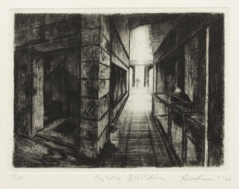
The title of the work has been changed to In the building. Drypoint accents have been added in the foreground. Two prominent oblique lines have been added above the windows at the left of the corridor, and all the principal receding lines have been strengthened. The three window partitions at left have almost disappeared with the addition of a veil of vertical hatching. The effect of this is to sharpen the contrast between the dark foreground and the light distance. An irregular patch has been outlined on the floor in the lower left corner, and the geometric shapes on the far wall in the stairwell have been clarified.
XI. 11th and final state, 2014, as In the building
The far wall of the stairwell has been burnished to lighten it.
Impression on buff wove BFK Rives paper, printed by Rick Amor in his Alphington studio. Inscribed in pencil, below the plate mark: lower left: ‘1-11’; lower centre: ‘In the Building’; lower right: signed and dated ‘R Amor ’14’.
Drypoint. A view along a corridor from the corner of an inner-city shopping arcade, with a figure in the far distance at a doorway; the surrounding area is illuminated by three circular hanging lamps. At the centre right is the partial, rear view of the figure of a man beside a glass vitrine. At left, in the corner of the building, is an entrance to a stairwell. The image is constructed with sharply receding one-point perspective. In its first application here, the drypoint is worked in a graphic, rather than tonal, way.
Lines of horizontal shading on the corridor floor now extend evenly from the foreground to the end of the furthermost vitrine. The outlines of the vitrines have been strengthened with drypoint, and the floor around the stairwell corner has been darkened. The most distant pool of light on the floor at the end of the corridor has been covered with delicate strokes of drypoint.
The area around the three hanging lights, and their reflection on the floor, has been burnished, causing the figure to disintegrate in the distance. Horizontal hatching has been added to the bottom of the middle vitrine. The head of the figure at right has also been burnished and now can be seen clearly.
The figure in the distance has been filled in with drypoint, and horizontal lines have been added to the entablature above the doorway. Two patches of shadow to the left of the corridor have been strengthened and extended.
The figure in the distance has been burnished so as to make it clear that he is walking. Light horizontal lines have been added to the lower part of the nearest vitrine at right. Faint striations of burnishing have been applied to the lines of perspectival recession in the corridor. There are three variant impressions of this state.
The lowest part of the corner area to the left of the corridor has received an irregular line of vertical hatching.
The title of the work has been changed to In the building. Drypoint accents have been added in the foreground. Two prominent oblique lines have been added above the windows at the left of the corridor, and all the principal receding lines have been strengthened. The three window partitions at left have almost disappeared with the addition of a veil of vertical hatching. The effect of this is to sharpen the contrast between the dark foreground and the light distance. An irregular patch has been outlined on the floor in the lower left corner, and the geometric shapes on the far wall in the stairwell have been clarified.
The far wall of the stairwell has been burnished to lighten it.
- Catalogue Number
- E.171
- Title and Date
- Arcade
2012; reworked and retitled 2014
- Subsequent Title(s)
- In the building
- Description of Featured Image
- A view along a corridor from the corner of an inner-city shopping arcade, with a figure in the far distance at a doorway; the surrounding area is brightly illuminated. At the centre right is the partial figure of a man beside a glass vitrine, his back turned. At the left, in the corner of the building, is an entrance to a stairwell. The image is constructed with sharply receding one-point perspective.
- Where Made
- Alphington, Melbourne
- Medium Category and Technique
- Intaglio Print: Drypoint, burnishing and etching on copper
- Support
- Wove paper. Identified papers: Somerset paper with watermark.
- Dimensions
-
Image size: 147 x 200 mm
Matrix size: 150 x 200 mm - Artist’s Record Number
- RAE.209 (2012), RAE.212, RAE.215 (2014)
- Printer(s) and Workshop(s)
- States I through VIII printed by Rick Amor in his Alphington studio. First edition printed by Simon White at the Australian Print Workshop, Fitzroy (Melbourne). State IX printed by Simon White at the APW. Second edition printed by Rosalind Atkins at Kate Herd’s studio, Alphington. States X and XI printed by Amor in the Alphington studio.
- Summary Edition Information
- Eleven states. Two editions. First edition: edition of twenty numbered impressions, 2012 (Arcade). Second edition: edition of ten numbered impressions, 2014 (In the building).
- Literature
- For an illustration of the watercolour The arcade, 2010, see Liverpool Street Gallery, Rick Amor – Watercolours and Paintings 2011 (exh. cat.), Liverpool Street Gallery, Sydney (in association with Niagara Galleries, Richmond, Victoria), 2011, cat. no. 5.
- For an illustration of the painting In the building, 2014, see Philip Bacon Galleries, Rick Amor (exh. cat.), Philip Bacon Galleries, Brisbane, 2014, pp. 4–5, cat. no. 3.
- Collections
- State Library of Victoria, Melbourne: eleven state impressions, numbered 1-1 through 1-7, 2-7, 3-7, 1-8, 3-8, all dated 2012; two state impressions, numbered 1-9, 1-11, dated 2014; ed. 2/10, dated 2014.
- British Museum, London: APW presentation proof 1/1, dated 2012 (2013,7021.3).
- Comment
Just as the facades of buildings interest Amor, for the secret interiors and lives they hide, so too do arcades fascinate him. Enclosed, with multiple doorways to unknown spaces, yet open at each end, arcades seem to him to be full of mystery.
The composition of E.171 repeats, with significant variations, that of the 1995 drypoint of the same title (cat. no. E.093); both prints belong to a group of similar images painted in watercolour and oils, and were inspired by Melbourne’s Capitol Arcade, which runs between Swanston Street, Howey Place and Collins Street.
The first state of E.171 is after the composition in a watercolour titled The arcade and painted in 2010 (Liverpool Street Gallery 2011), while the final, etched state follows the version of the subject that is depicted in an oil dated 2014, In the building (Philip Bacon Galleries 2014).
Amor has always liked to reconsider subjects he has painted or etched earlier; he does this by changing aspects of an image so as to extract different meanings, explore different visual perspectives, or create shifts in atmosphere or mood. In this drypoint, the point of departure is the way that he depicts the space of the arcade. Whereas the 1995 print showed the arcade as a wide corridor, the 2012 arcade is narrow and canyon-like, almost vertiginous in its sharp recession – the receding diagonals of the floor assuming a perceptual function like that of a railway track speeding the eye into the distance.
Key to the development of the drypoint through its first eight states, towards the first edition (2012), was the relationship of the foreground to the light-well in the distance. The three pools of light on the ground in the first state, reflected from three hanging lamps, eventually gave way to a more intense brightness, with expanded, merging pools of light on the floor.
In 2014, Amor returned to the plate, wanting to explore further the dramatic aspects of the image. He added more drypoint accents to the foreground, and enhanced the contrast between foreground and background by adding ruled orthogonals on the left wall of the corridor, while strengthening the existing ones with drypoint; he also changed the title of the work to In the building.
After the second edition of the drypoint was printed, Amor made the radical decision to etch the plate. He then took it through two more states, making major changes to the architecture in the middle and far distance and replacing the walking figure in the distance with a running man. At this point, dissatisfied with the vertical elements of the composition, he ceased work on the plate.
The first edition of E.171 was made as a fundraiser for the Australian Print Workshop.
- Keywords
- Capitol Arcade, Melbourne
- URL
- https://catalogue.rickamor.com.au/works/intaglio/arcade-2/
Record last updated 17/02/2021